Let’s sort through the gold charts, shall we?
 Bullion.Directory precious metals analysis 1 March, 2015
By Terry Kinder
Investor, Technical Analyst
With the gold price oscillating around the $1,200.00 level, and off the lows a bit, now is a good time to examine some gold price charts to see what they can reveal about where the gold price may be headed.
Daily Gold: Schiff Pitchfork
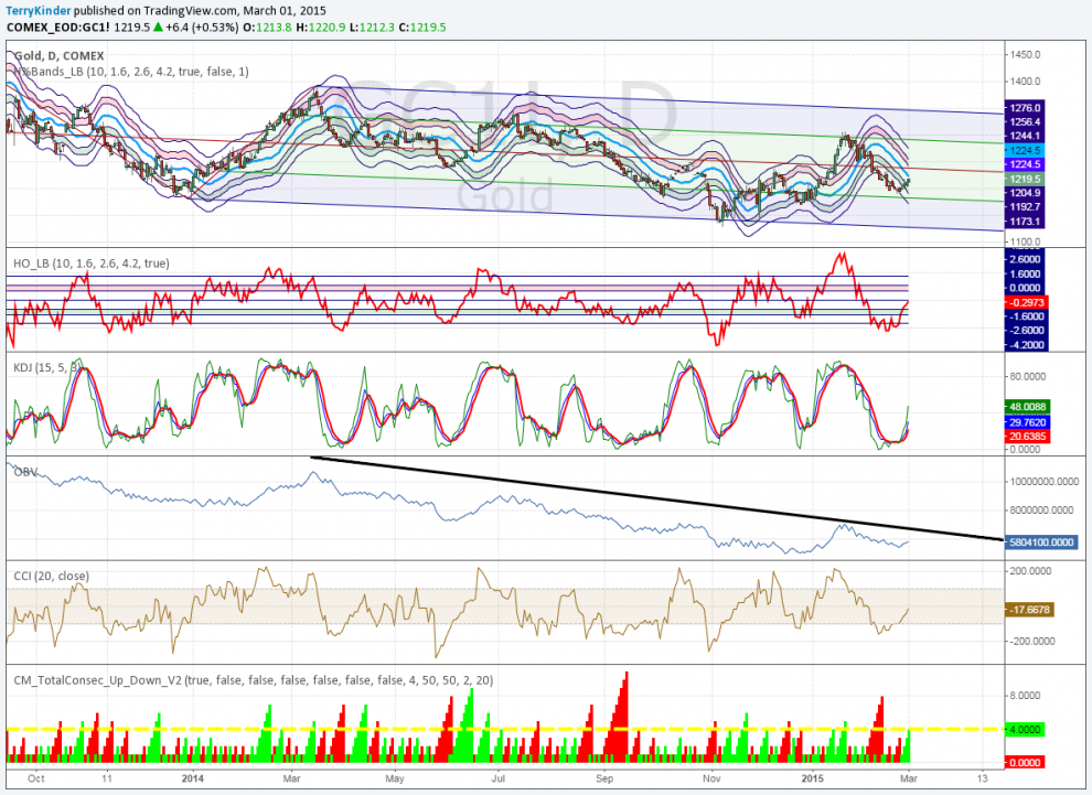
On the daily chart, gold still remains in a Schiff Pitchfork with a slight downward bias
On the daily chart, gold is showing some strength. The price has been moving higher, but is yet to cross above the red mid-line of the descending Schiff Pitchfork. However, gold is no longer oversold on the Hurst Oscillator, as can be seen by the fact that price has moved above the green shaded area.

On-Balance Volume (OBV) has been unable to break above a nearly year old downtrend line, so there is still work for gold to do if it is to hope to move significantly higher in price.
Gold Price Regression Channel
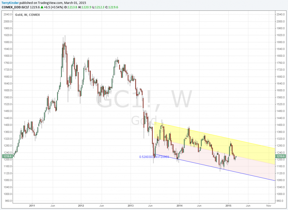
The gold price remains within a descending price channel
On a weekly basis, gold remains within a downward price channel that it has been in since around June of 2013.
Gold Price Pivots
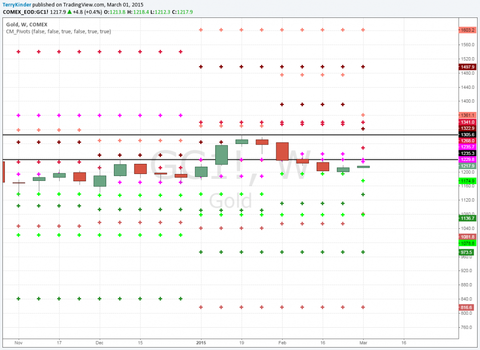
On this weekly chart of gold, highlighting weekly and monthly pivots, there is resistance near the $1,230.00 mark
While gold has been moving up in price as of late, it does look to encounter some resistance on the chart of weekly and monthly price pivots near the $1,230.00 level. If $1,235.70 can be overcome, then the next area of resistance would be $1,268.00. Support for gold can be found at $1,174.90 and below.
Weekly Ichimoku Cloud Chart
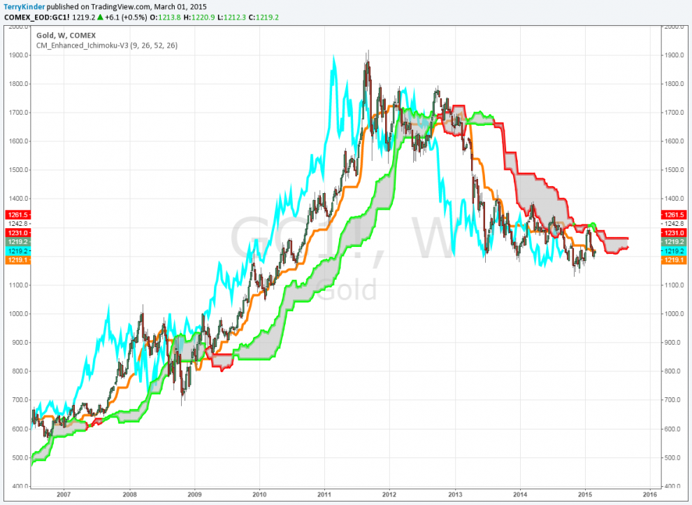
To break the downtrend on this Ichimoku Cloud Chart, the gold price would need to climb to at least above $1,261.50
The Ichimoku Cloud Chart is one of the charts that most graphically illustrates the situation the gold market and price is in. On the left-hand side of the chart you can see the cloud has a green outline, signifying price is trending higher. On the right-hand side the cloud is red, meaning the price is trending lower. The light blue (or lagging line) is above the 26-period orange line during the gold bull market until it peaked in 2011. Then, the blue line crossed below the orange line and has largely remained there since then. Until the blue line crosses above the orange line, and the gold price moves above the Ichimoku Cloud – currently near $1,261.50 – then the current downtrend should be assumed to remain in place.
Monthly Gold Pitchfan / Fib Spiral
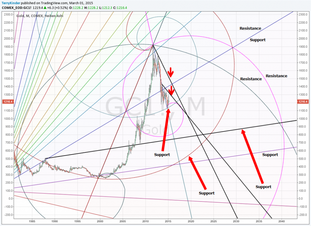
There are assorted support and resistance levels on this combined pitchfan, Fib Spiral chart
Things start to get interesting when you look at the combined Pitchfan / Fib Spiral chart. The gold price is very near to breaking through the Fib Spiral support. The gold price has already broken below the blue diagonal Pitchfan support level near the end of last year.
Should the gold price break through the Fib Spiral support (near the arrow and pinkish-purple colored Fib Spiral) then there is not a good deal of support below it as can be seen on the chart. Things become even more interesting when we add another layer to the chart – Phi Circles.
Monthly Gold Pitchfan / Fib Spiral / Phi Cirles
This next chart is, unfortunately, pretty heavy visually, but worth it if you’ll stick with it a bit. It may help to refer back to the previous chart in order to get your bearings from time to time.
Adding another layer to the previous chart provides additional support and resistance information
I understand there is a tremendous amount of visual information represented on the chart above. It can be overwhelming at first. However, if you’ll follow along, I believe it will be rewarding. Here’s just a few noteworthy features of the chart:
1) Two resistance lines signaled by the red arrows. The gold price, as of yet, has been unable to break above them. Obviously, for the gold price to reverse it’s overall downtrend, price need to break above these resistance lines;
2) The gold price, to the left of the bottom red arrow, broke below both a Pitchfan support level (the blue line) and fell out of one of the red Phi Circles. You’ll notice a lot of price oscillation (up and down price action). This is typical of the price when it crosses above or below one of the Phi Circles;
3) After falling out of a smaller Phi Circle, the price fell into the large circle at the bottom of the chart that overlaps with the bottom half of the large circle at the top of the chart. While it is difficult to see, the price has fallen into the lower large circle. This implies that the price is likely to continue moving lower until something acts to push it higher;
4) Not too far below the current price is the bluish-green Fib Spiral support level. This is highlighted in the previous chart. If that level fails, the next logical level would be the bottom of the larger circle from the top half of the chart. This is very near the pinkish-purple Fib Spiral.
I could go on, but I think you get the idea. Long-term the gold price has to find something to bounce off of – either a Fib Spiral or a Phi Circle. Those potential areas to catch a bounce are significantly lower than the current price.
Some will probably view the above as unduly negative. That is not the intent at all. Instead, the intent is to do two things:
1) Temper the current view which appears to be tending toward the idea that the price has either bottomed or is near the bottom;
2) Encourage those who either wish to accumulate more gold or start accumulating gold, to look at the chart to gain an understanding of when might be the best time to increase their holdings.
As a current holder of physical precious metals, I am as anxious as anyone else is for the price to move higher. On the other hand, as a price analyst my job is to paint a picture of the gold price as it is (as best I can) rather than how I would like it to be.
There may be significant opportunity to obtain gold at favorable prices. This is neither good nor bad – it just is. If you haven’t purchased any gold in the past, you may be presented with an opportunity that many believed had already passed us by. If you have purchased gold, and wish to add more to your position, you may have an opportunity over time to add more at prices that may not be seen again for a substantial amount of time. Stay tuned as this story continues to unfold.
Bullion.Directory or anyone involved with Bullion.Directory will not accept any liability for loss or damage as a result of reliance on the information including data, quotes, charts and buy/sell signals contained within this website. Please be fully informed regarding the risks and costs associated with trading in precious metals. Bullion.Directory advises you to always consult with a qualified and registered specialist advisor before investing in precious metals.