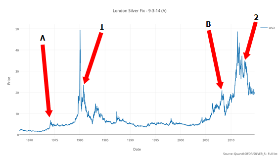
What do you see when you look at this silver chart?
 Bullion.Directory precious metals analysis 4 September, 2014
By Terry Kinder
Investor, Technical Analyst
I sat on the bed. I looked at the Rorschach blot. I tried to make it look like a spreading tree, shadows pooled beneath it, but it didn’t.
It would be nice if technical analysis were purely scientific, but it isn’t. Looking at the silver chart above, you will notice labels A, B, 1 and 2. The labels point to somewhat similar looking features on both the 1970’s run up in the price of silver and the latest run. One can make the argument that A and B were both mini-tops that occurred before final blow off tops. It can also be argued that 1 and 2 were spikes up before the price of silver continued lower.
On the other hand, an argument can be made that B and 2 combined are merely the big brother to A and the current drift down is just a pause before a massive explosion in the price of silver. We could analyze the silver chart all day long, apply lines, indicators and make historical comparisons.
In the end, this chart of silver is a Rorschach test.
Bullion.Directory or anyone involved with Bullion.Directory will not accept any liability for loss or damage as a result of reliance on the information including data, quotes, charts and buy/sell signals contained within this website. Please be fully informed regarding the risks and costs associated with trading in precious metals. Bullion.Directory advises you to always consult with a qualified and registered specialist advisor before investing in precious metals.


 Material provided on the Bullion.Directory website is strictly for informational purposes only. The content is developed from sources believed to be providing accurate information. No information on this website is intended as investment, tax or legal advice and must not be relied upon as such. Please consult legal or tax professionals for specific information regarding your individual situation. Precious metals carry risk and investors requiring advice should always consult a properly qualified advisor. Bullion.Directory, it's staff or affiliates do not accept any liability for loss, damages, or loss of profit resulting from readers investment decisions.

Leave a Reply