Today, in honor of presidential giants such as Millard Fillmore, Franklin Pierce and James Buchanan, we present our Presidents Day Gold Chartfest.
 Bullion.Directory precious metals analysis 16 February, 2015
By Terry Kinder
Investor, Technical Analyst

Seal of the President of the United States. Image: Wikimedia
While the history of the presidency is interesting, in the final analysis the occupants of the Oval Office are likely much less relevant to our future than than the overarching cycles that drive events and the powers that ultimately narrow our choices to the two candidates that we are allowed to choose from every four years.
It is this system of false choices, both political and economic, that gradually erodes the public confidence in both the political leadership and the idea of economic opportunity. It is this failing confidence, rather than the laundry list of the usual suspects, that will eventually drive the public into gold. This will take time as the public often does not sense the danger until it is right upon them. So, while the price of gold has often not behaved as the gurus asserted it ought to, it will eventually strengthen.

This strengthening may not be to the degree that some hope or believe it will be. Despite all of the so-called fundamental reasons gold should rise in price, it may not behave as the experts expect it should. In the end, price does what it will, not what one or the other expert, guru, forecaster, or whomever believes it should.
You merely need to look at each year since 2011 to find a slew of wrong forecasts.
Wrong forecasts though, don’t mean gold won’t eventually rise. Right forecasts in the past, don’t mean a call for gold to rise soon will come to pass. The best indicator for price is price – not some fundamental factors that no two or three individuals will ever agree on. Those fundamental factors are somewhat like ranking our favorite presidents. Some love Clinton, some don’t.
Some saw Nixon as a masterful politician and statesman while others believed he disgraced the office. So, in regards to gold, rather than go down the same road as those who may debate who is a great president and who is not, let us examine the price and let it be our guide.
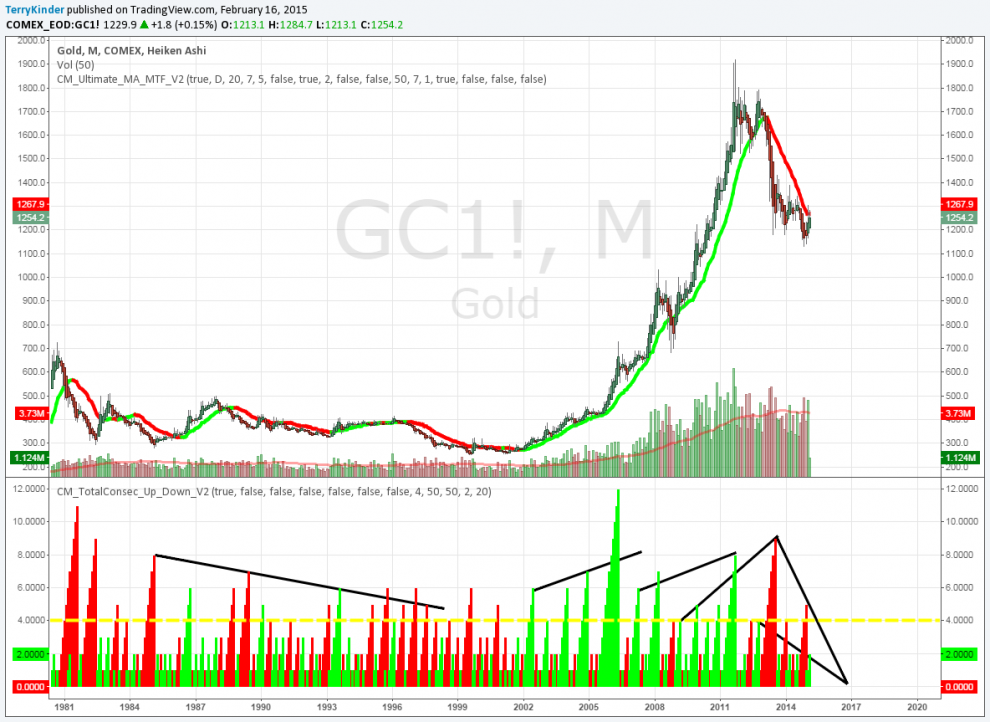
Due to the number of charts, I’m not going to make any effort to put them in any particular order. In some ways this can be a good thing as often you can gain some interesting insights and discover interesting relationships this way.
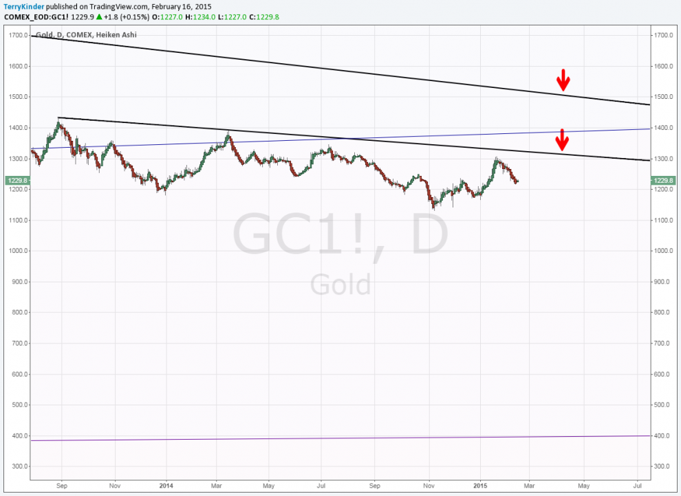
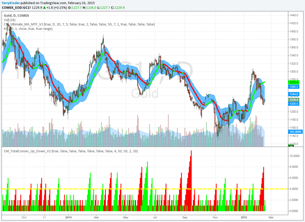
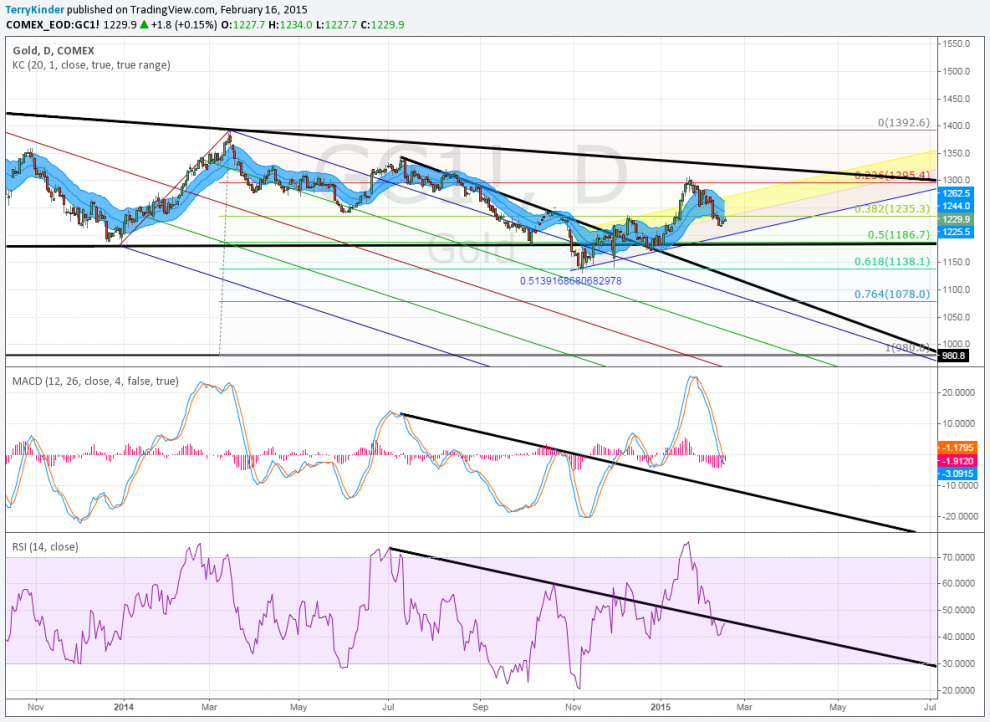
On the daily chart gold has not yet broken above price resistance.
Gold has recently had difficulty breaking above price resistance. In the above chart you can see two different price resistance lines. Since September 2013 the gold price has been unable to break above the downward sloping lower resistance.
The price has slipped below previous support. Next support level is currently below $1,200.00.
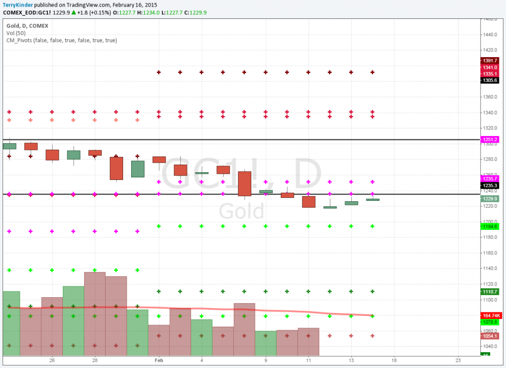
Our next chart above shows the monthly and yearly gold price pivots. You will notice that the price recently fell below the two plus signs that previously represented price support – now resistance. The next support level is now $1,194.60.
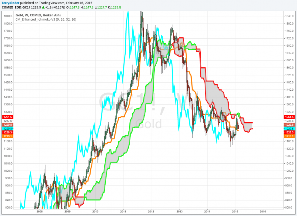
The gold price has been unable to break above the red outlined Ichimoku Cloud.
Above is the Ichimoku Cloud weekly chart. Price has been trapped below the red outlined cloud most of the time since the 2011 high. Price did move above the 26-period gold line. However, price has been gradually dropping back down toward the line. Should the price drop below that line, it would be a bearish sign.
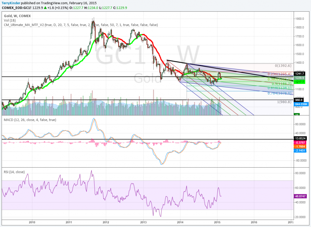
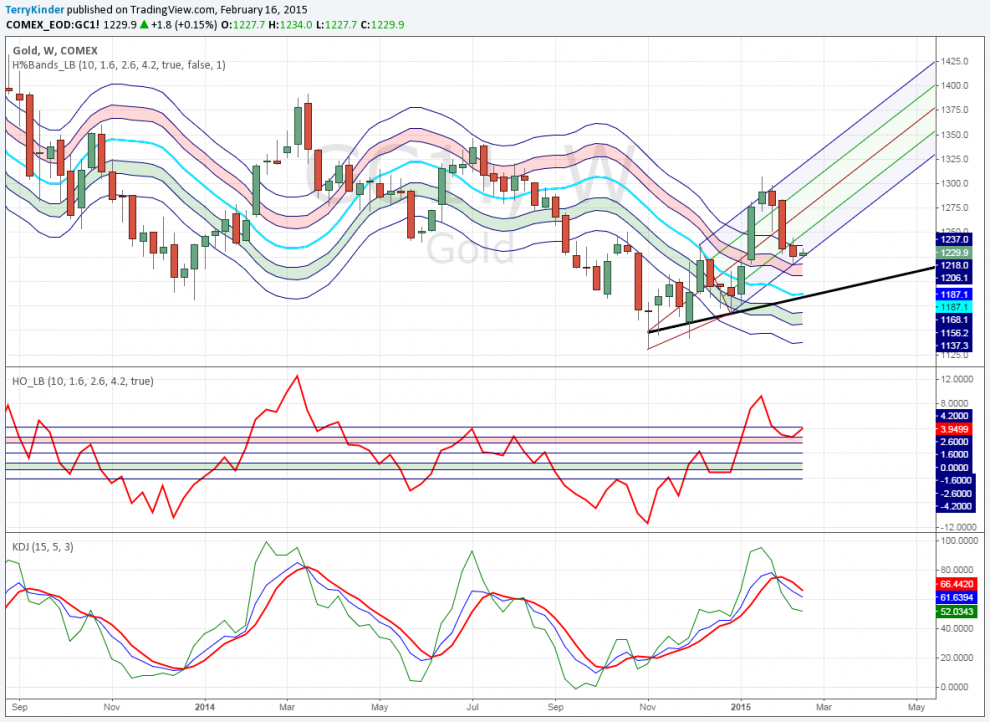
While the rate of the gold price’s drop has slowed, it has been unable to gain sustained upward momentum.
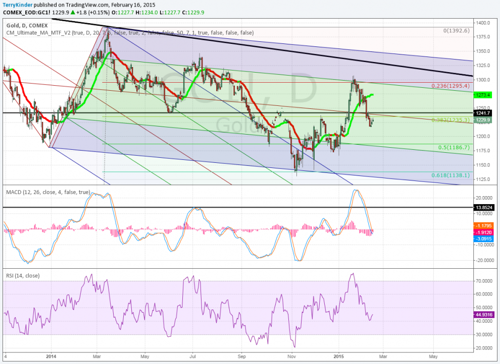
In the weekly pitchfork chart above the gold price’s rate of decline has slowed, but it has been unable to gain and hold upward momentum. The $1,295.40 (0.236 Fibonacci Retracement) and $1,235.30 (0.382 Fib Retracement) levels have both proven difficult to overcome.
There are two pitchforks drawn on the chart. One descends at a steeper angle than the other. Price managed to exit the first pitchfork, but has been unable to move above the price trigger line. This trigger line can be seen running from point 2 of the original pitchfork and crossing through the upper parallel line of the second pitchfork. The inability of price to move above the price trigger represents weak momentum.
Another concerning point for the gold price is the failure of price to move and hold above the red median line of the second pitchfork. If price momentum were strong, then we might expect the price to move toward the upper parallel line in an attempt to break higher. In this case, price moved above the median line, but reversed before moving to the upper parallel line. This failure, combined with the failure of price to move anywhere close to the price trigger signals continued weakness for the gold price.
This is the daily view of our same two pitchforks in the chart above.
Our next chart above is simply the daily view of the same pitchforks seen in the previous chart. There are a couple of things of note here. First, the Volume Weighted Moving Average (VWMA) line that is alternating between red and green is currently green. This indicates that price momentum on the daily chart for gold is currently looking more bullish. Second, MACD, after moving significantly higher, reversed back down below the zero line which indicates weakness. This weakness is confirmed by the fact that price dropped below the median line instead of testing the upper parallel line of the pitchfork.
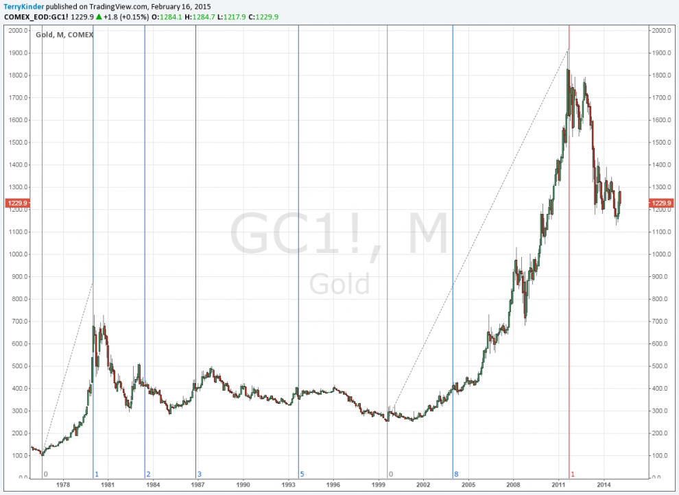
A longer-term look at the gold price using Fibonacci trend time analysis.
The above chart is part one of two of a longer Fib time zone showing the last two large moves higher in gold. You can plot two prices and the Fib time zone will project out into the future points where price may change direction.
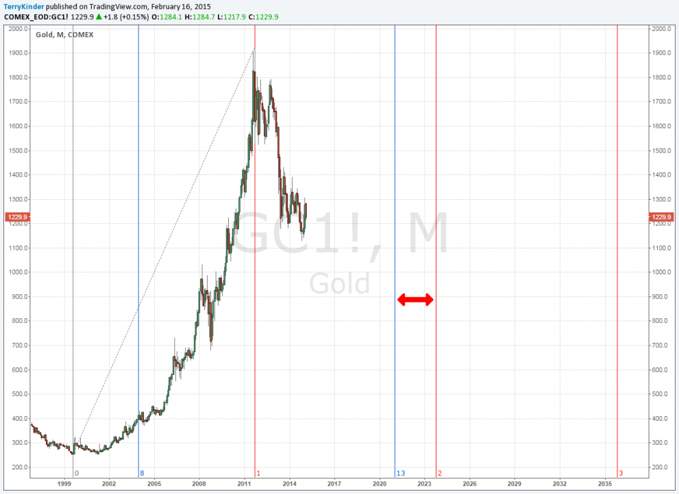
I expect an important change in direction of the gold price could occur somewhere near the 2020 – 2023 time frame.
The chart you see above is part two of the longer Fib time zone. The blue vertical lines are based on the 1976 – 1980 move in the gold price. The red vertical lines are based on the 1999 to 2011 move in the gold price. What is noteworthy is the time period noted by the red double arrow. This 2020 to 2023 time period is one where I anticipate we’ll see an important change in the gold price trend.
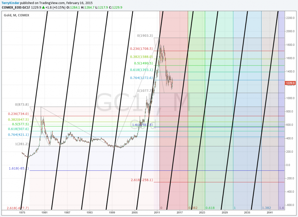
This action-reaction chart of gold, combined with a trend-based Fib time, also indicates 2020 – 2023 will be an important time for the gold price.
The chart above is based on Alan Andrews’ concept of action-reaction. It also combines the element of a trend-based Fib time period. Not too surprisingly, the chart indicates largely the same thing as the two previous charts – that the roughly 2020 – 2023 time period will likely mark the area where the gold price will change trend. My read is somewhere during or near this time period gold will see an important low price before resuming a bull market.
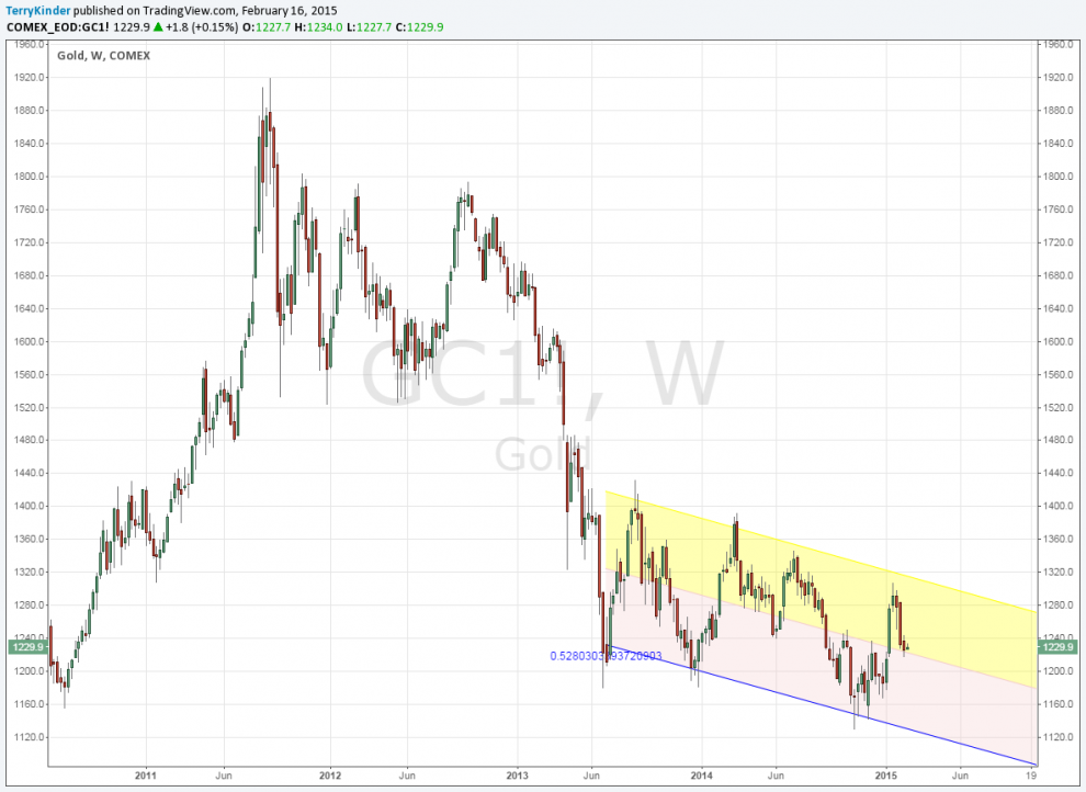
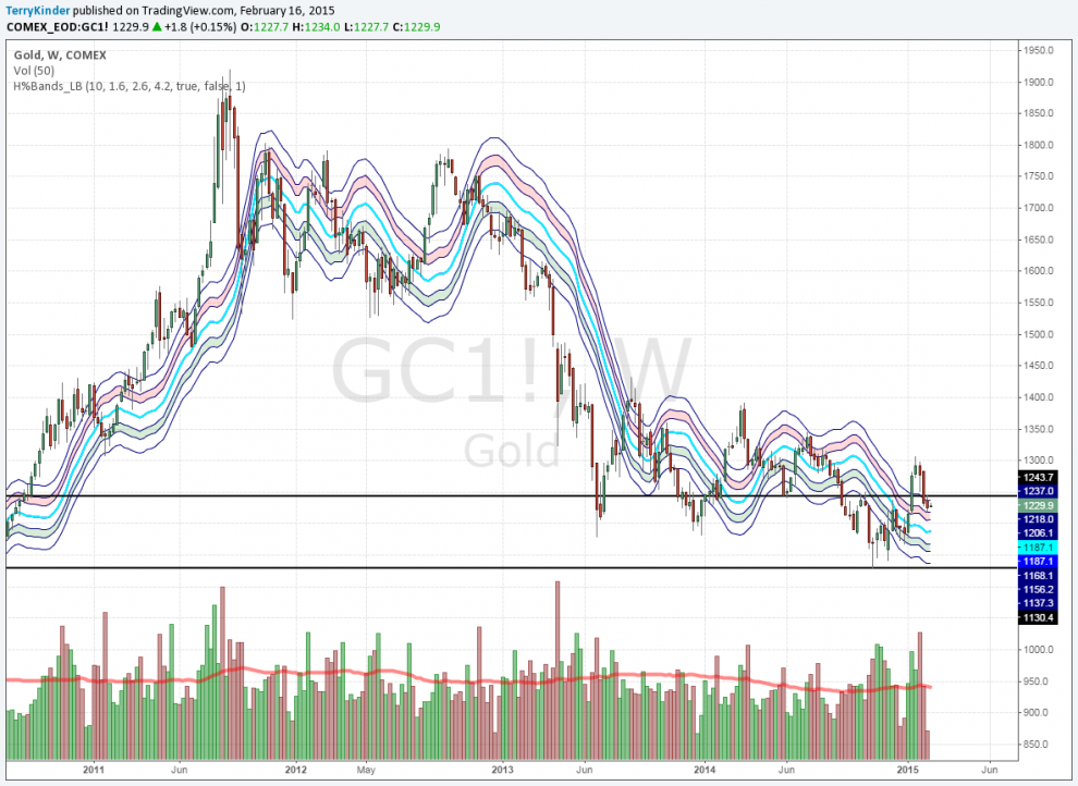
On this weekly chart you can see that gold has been in a descending price channel since the middle of 2013.
The next chart above indicates that the price of yellow metal, on a weekly basis, has been in a descending channel since the middle of 2013.
On the monthly chart you can see the bearish bias.
The chart above shows the Volume Weighted Moving Average (VWMA) above and the Bull-Bear indicator below. Both indicators currently paint a bearish picture on a monthly basis.
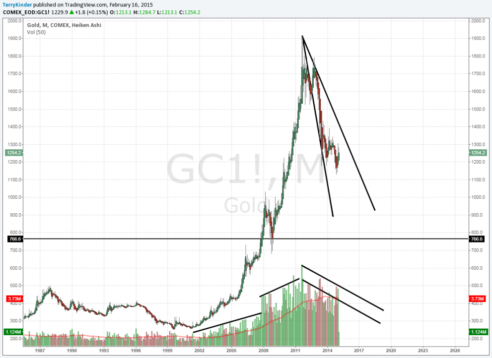
Both the price resistance lines and volume largely point downward.
Our next chart features price trend lines as well as volume information on a monthly basis. Both the trend lines and volume have a downward bias.
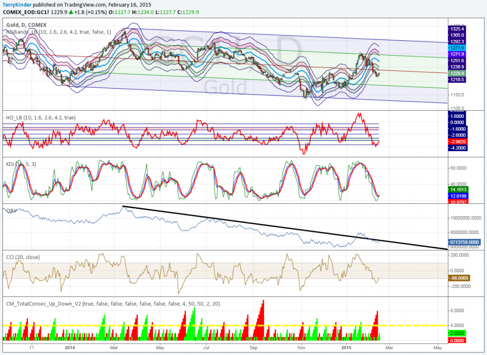
This daily chart presents a somewhat mixed picture.
The daily gold chart above presents a somewhat mixed picture. While the Hurst Bands and Oscillator, indicate price has reached an oversold level (below green band), the On Balance Volume (OBV) points to weak upward price momentum. KDJ and the Commodity Channel Index (CCI) point to the possibility of a higher price, but the Bull-Bear indicator shows only weak bullishness.
This daily chart shows the gold price could move higher.
In the daily gold chart above there is the possibility that the price could move higher. The blue shaded Keltner Channels show the strong downtrend weakening. Whenever price is below the channels this indicates strong downward price momentum. The opposite is true when price is above the channels.
On this weekly chart with Hurst Bands, the gold price is overbought.
Our next chart above is a weekly chart with Hurst Bands. The price is still in an extremely overbought state (above the pink shaded band).
This chart could prove to be bad news for gold.
The penultimate chart above could prove to be bad news for gold. The weekly price is currently near the bottom parallel line of the Andrews’ Pitchfork and is threatening to fall below it. Should this happen – which seems probable given the price is overbought on the Hurst Bands – then it would set up the possibility that price could fall to the sell trigger (black line running up and to the right disappearing off the chart at $1,218.00. If price falls through the sell trigger, then the gold price may be facing another trip down to the $1,130’s. In addition, the KDJ indicator has turned bearish as well.
On this daily chart, the gold price has failed to break higher.
Our ultimate chart above is another daily of gold. It shows the difficulty gold has had in breaking and holding above $1,295.40. While the gold price, since November, has been traveling upward in an ascending price channel, it hasn’t been able to get close to the price trigger line which can be seen crossing off the chart near the $1,300.00 level. The gold price would need to clear the price trigger line and then break above $1,392.60 in order to see the daylight of higher prices.
In addition, MACD and RSI both look rather weak. MACD has crossed back down below the zero line and RSI only briefly managed to rise above a falling resistance line dating back to July of 2014.
Conclusion
Overall, the trend of the gold price has been down as should be apparent looking at the weekly and monthly charts. Some of the daily charts offer hope the price could move higher.
In the end, weekly and monthly trends trump daily trends. Of course, the daily moves are the stuff weekly and monthly moves are made of. However, until the gold price can clearly and convincingly break through overhead price resistance the price bias remains down.
Note: I don’t really think Fillmore, Pierce or Buchanan are presidential giants. I’m using a little thing I like to call sarcasm.
Bullion.Directory or anyone involved with Bullion.Directory will not accept any liability for loss or damage as a result of reliance on the information including data, quotes, charts and buy/sell signals contained within this website. Please be fully informed regarding the risks and costs associated with trading in precious metals. Bullion.Directory advises you to always consult with a qualified and registered specialist advisor before investing in precious metals.